Great Ways to Use the Pantone Colors of the Year 2016
Jan 18, 2016 • Aldrin Tirones (Illustration)
Jan 18, 2016 • Aldrin Tirones (Illustration)
In a bold move that aims to “challenge traditional perceptions of color association,” Pantone announced two colors of the year for the first time ever.
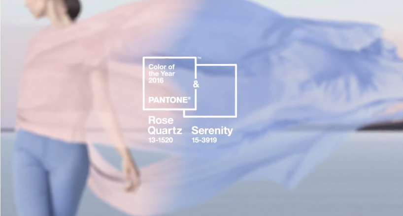
The colors of the year are “a symbolic color selection; a color snapshot of what we see taking place in our culture that serves as an expression of a mood and an attitude,” according to Pantone. Indeed, the choice of the warm tones of Rose Quartz and soothing coolness of Serenity have a striking sense of balance, telling of our times.
People have taken to the new colors like fish to water, but how to apply these new hues to your daily life? Here are a few ideas.

With the lines between gender-associated colors blurring further and further, the new hues are a great introduction to challenging the status quo.
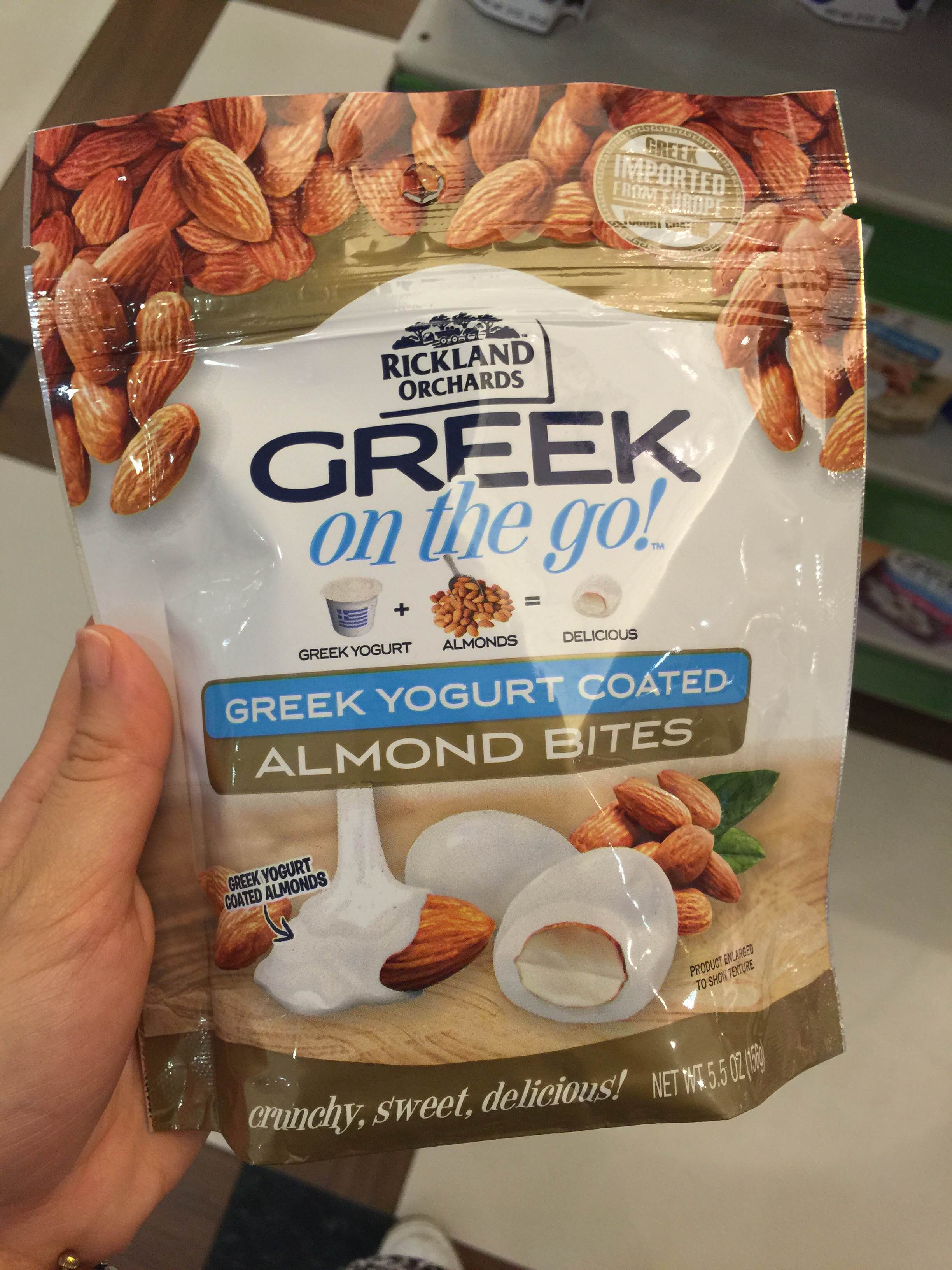
Together, Rose Quartz and Serenity make things even more delectable.
Why not take your hair game up a notch? These #hairgoals are to-dye for.
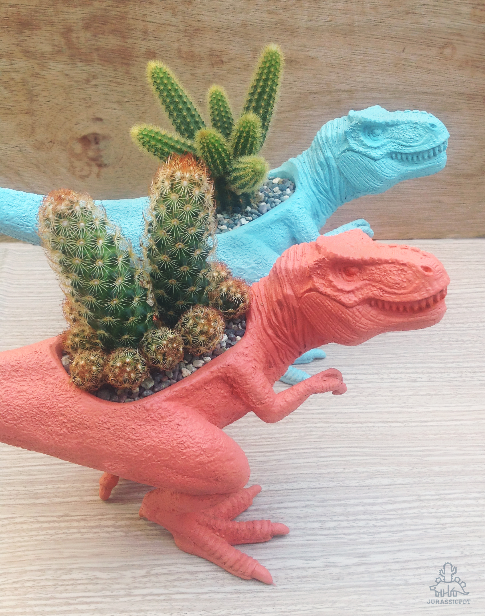
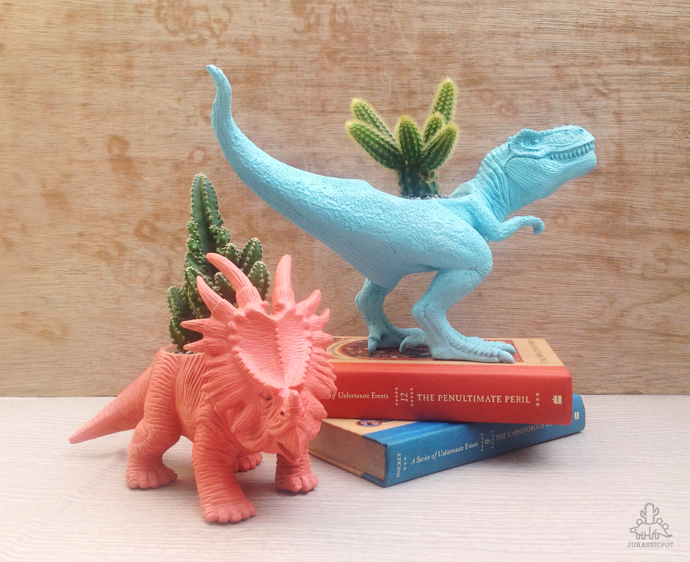
Get whimsical with your color applications and add some much-needed life to your desk and home decor. These color of the year dinoplants are available at the Jurassic Pot online shop.
Input your search keywords and press Enter.